In the ever-changing field of creative communication, branding is the foundation of identity and connection. It’s more than just visual design; it captures the essence and spirit of a concept, product, or even an entire city. Exploring the world of branding leads us into a journey of inspiration through 45 award-winning projects that push the limits of creativity.
Our journey into the heart of innovation takes center stage with the celebration of 45 remarkable branding projects honored by the Creative Communication Awards (C2A). Each branding project, a tribute to the power of creativity, tells a unique story that has earned its spot among the best in branding. Let’s explore the diverse range of these branding projects, where strategic brilliance and design innovation come together to create lasting impressions.
Best of Best in Brand design / Branding
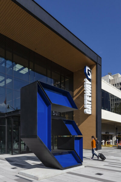
Gateway Newark, honored with the “Best of Best in Brand Design/Branding” at the Creative Communication Awards (C2A), is a Gensler masterpiece led by Brian Brindisi and Beth Novitsky. Crafted for Onyx Equities, LLC, this project revitalized Newark with a robust brand identity, incorporating vibrant marking and integrated placemaking.
The campaign, “Where Newark Comes Together,” reflects the city’s diversity, becoming a convergence point for culture, transit, and technology. Utilized as an environmental graphics program during construction, Gateway Newark transforms empty spaces into engaging showcases, embodying innovation in branding projects.
Best of Best in Other / Branding

Factory’s exceptional work on the ADM Show 2022: & Beyond has earned the prestigious Best of Best award in the Other/Branding category. Led by Roy Wang and his team, including Chrystal Lim, Tamelia Lim, and Sandra Lau, Factory designed the festival to showcase the creativity and innovation of graduates from the Nanyang Technological University, School of Art, Design & Media.
In a year marked by global adaptation to new ways of life, the ADM Show 2022 presented a platform for graduates to challenge the status quo and propose creative solutions for societal progress. Factory’s thoughtful approach and impactful design have set a new standard in the realm of branding, making them the Best of Best in the field.
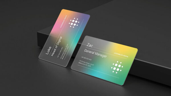
Best of Best in Brand identity / Branding

NakedLab’s renaissance into a premier wellness brand, orchestrated by THE CABINET, clinched the coveted “Best of Best in Brand Identity/Branding” at C2A. Helmed by Malou Ko, THE CABINET’s creative touch turned the founder’s love for the Maldives into a visual symphony, infusing beach and ocean elements into the brand.
The rebranding narrative extends beyond aesthetics, with the tagline “Having a Blissful Day Everyday” promising tangible results from NakedLab products. The logo’s softer handwriting style and graphic elements, resembling an inviting arch, create a visual journey toward comfort and leisure.
Malou Ko’s 15 years of award-winning expertise, working with global giants like Standard Chartered and Ralph Lauren, amplifies the value of NakedLab’s transformation. This rebranding story not only showcases visual elegance but also invites readers into a narrative of relaxation and everyday bliss, making NakedLab a standout in the world of branding projects.
Best of Best in Promotional items / Branding
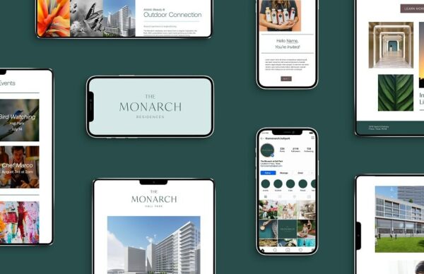
The Monarch at HALL Park, a beacon of excellence in promotional items and branding secured the prestigious “Best of Best” accolade at the Creative Communication Awards (C2A). Crafted by the masterful team at RSM Design, led by Harry Mark FAIA and supported by the creative prowess of Steve Luoma and Xian Wong, this project epitomizes the seamless fusion of lifestyle, culture, and luxury.
Nestled in the suburban oasis of Frisco, The Monarch emerges as a vibrant burst of color amid nature’s serene canopy. It redefines living with a unique blend of convenience and culture, offering resort-style amenities and a daily immersion into art, culture, and nature. The Monarch becomes more than a residence; it embodies a holistic approach to balanced living.
RSM Design, with Harry Mark FAIA at the helm, curated the brand identity, website design, print and digital applications, and a stationery suite for The Monarch. The result is a visual symphony that not only captures the essence of this luxurious haven but also reflects the lifestyle it promises.
In the world of branding projects, The Monarch at HALL Park shines as a testament to the harmonious integration of design, lifestyle, and luxury.
Best of Best in Brand design / Branding

2:2 Akvavit, a triumph in brand design and winner in beverage packaging, secured the coveted “Best of Best” at the Creative Communication Awards (C2A). Crafted by the innovative team at Aida Pioneer, led by Dzmitry Apolenis, this project is a modern take on traditional Scandinavian akvavit.
Commissioned by Mikkelsen Distillery, the task was to create a concept inspired by the score of Scandinavian friendship. The idea stems from a real story during Euro 2004, where the teams of Sweden and Denmark, in a decisive match, both advanced to the playoffs with a 2:2 result, showcasing the Scandinavian art of negotiating.
The label of 2:2 Akvavit captures this historical moment, symbolizing camaraderie and the art of finding common ground. Aida Pioneer’s innovative approach not only elevates the brand but also pays homage to a significant chapter in Scandinavian sportsmanship. In the world of branding, 2:2 Akvavit stands tall as a celebration of tradition, friendship, and the art of negotiation.
Winner in Logo design / Branding
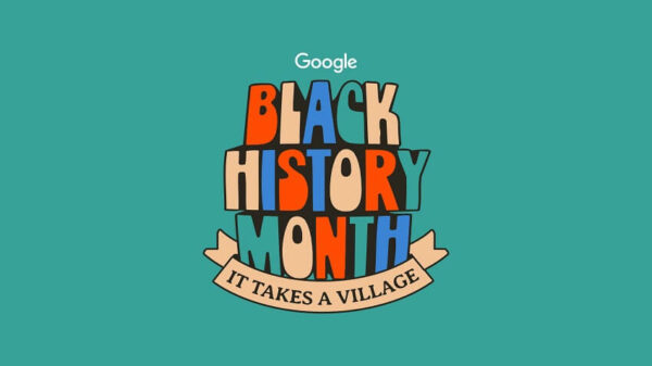
“It Takes A Village,” a beacon of social responsibility, clinched the esteemed “Best of Best” at the Creative Communication Awards (C2A). Crafted by the passionate team at Creative Theory Agency, led by Brandon Graham and supported by the creative prowess of J’Nay Penn and Asmara Holmes, this project is a testament to the power of community support and solidarity.
Commissioned by Google, the project draws inspiration from the phrase “It Takes a Village,” traditionally associated with creating better opportunities and environments for children. However, within the context of Black History, it extends to highlight the vital role of community support in the struggle for civil rights and social justice. African Americans have historically relied on the strength and support of their communities to overcome challenges and discrimination.
Winner in Brand identity / Branding

Caston Coffee Roasters, a triumph in typefaces and winner in brand identity and beverage packaging, earned the prestigious “Best of Best” at the Creative Communication Awards (C2A). Crafted by the talented team at YSFT INC, led by Yihuang Zhou and supported by designer Yixuan Cao, this project marks a significant step for Caston as it ventures into the consumer-facing market.
Based in a quaint town in China, Caston is a local coffee roastery with a robust B2B business, and YSFT was tasked with ushering Caston into a new era. The bespoke typeface, designed by Yihuang Zhou, features playful ligatures that symbolize using coffee to connect people and communities.
The incorporation of a bright lime color ensures eye-catching shelf presence, making Caston stand out in the market. To streamline packaging across the diverse product lineup, a sticker system was innovatively developed, allowing for easy customization by the internal team.
Winner in Brand identity / Branding, Brand design / Branding
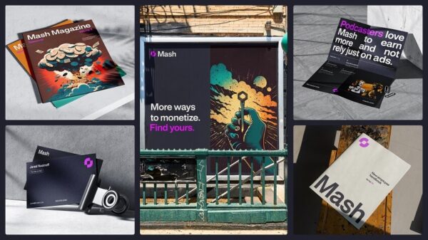
Crafted by the innovative minds at Milkshake Studio, led by Alex Martineau and Simon Goetz, and supported by a talented team including Noora Manchanda, Xochitl Lozano, Brenan Stetzer, and Ruairi Conway, this project is a transformative journey for Mash.
Positioned as a monetization toolkit for creators, media companies, and digital apps, Mash identified a market problem—overreliance on subscriptions and digital ads for monetization. With a vision for a more engaging solution that involves the audience, Mash approached Milkshake Studio for a brand and website overhaul.
Milkshake Studio stepped in at a crucial time when Mash’s product garnered immense interest, yet their brand and website fell short of reflecting their identity. The goals were clear—to create a future-forward and flexible brand, accompanied by a dynamic website that would resonate with their audience.
Winner in Brand identity / Branding
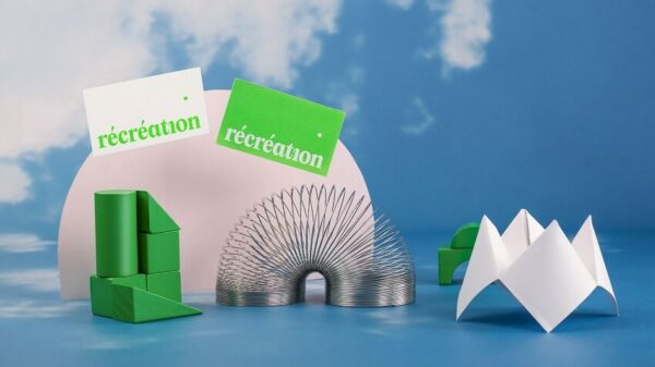
Récréation, a winner in brochures/books and brand identity, stands as a testament to creativity in Quebec City’s communication and design landscape. Led by the dynamic team at Récréation, including Art Director Catherine Lemieux and Graphic Designer Émilie Turcotte, the agency embarked on a transformative journey after a decade in the industry.
Récréation, which translates to “recess” in French, symbolizes a new chapter for the agency, one where rules are rewritten to secure victory. The brand embodies the current and future team robustly, offering a space where creativity knows no bounds—a playground where fresh, smart, and surprising ideas come to life.
Winner in Catalogs / Books, Promotional items / Branding
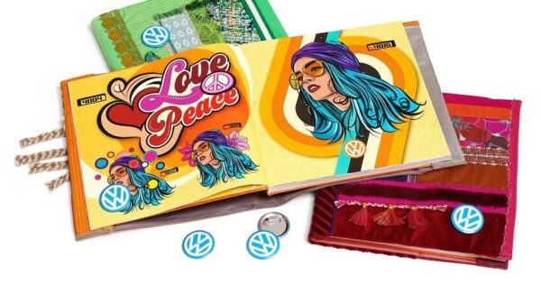
The Volkswagen Lookbook 4 “LOVE & PEACE,” a winner in catalogs/books and promotional items, is a visual masterpiece crafted by Klaus Trommer Design. Led by the visionary Klaus Trommer and supported by a talented team including Hauke Wilkens, Heike Nürnberger, Kai-Uwe Knoth, and Norbert Rieckhoff, this project pays homage to the “Love & Peace” generation and the iconic Woodstock festival.
Commissioned by Volkswagen Zubehör GmbH, the Lookbook 4 is a curated collection of illustrations, graphics, 3D visuals, and photographs. Exclusively distributed by Volkswagen to support licensees with merchandise artwork, this special book captures the essence of the 1970s—the “groovy” feeling of vibrance, fun, and happiness.
Each artwork catalogue is adorned with an individual, handmade book jacket and a pin button featuring Volkswagen’s original seventies retro logo. Klaus Trommer Design, specializing in visual artwork, has created a timeless tribute to an era known for its cultural impact and free-spirited ethos.
Winner in Brand Activation / Branding
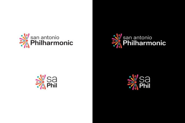
The New Brand Activation for The San Antonio Philharmonic, a winner in Brand Activation, stands as a testament to the transformative power of branding. Crafted by the innovative minds at Robot Creative, led by Mandy Dixon, this project was commissioned by the newly formed musician-led orchestra, The San Antonio Philharmonic.
To develop a new brand project and gain visibility to support their inaugural season, the San Antonio Philharmonic approached Robot Creative. In an astounding feat, Robot Creative completed the brand project launch within a mere 60 days, a process that typically takes months. The results were beyond expectations, with leaders reporting exceeding ticket sales in a short timeframe.
The new brand identity not only accelerated ticket sales but also resonated with musicians, supporters, and the local community. It better reflected the rich history, culture, and diversity of the San Antonio community, making symphonic music more accessible to a highly diverse audience.
Winner in Brand Activation / Branding
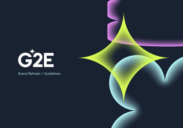
G2E: Gaming Unleashed, a standout in Brand Activation and Branding, is a triumph crafted by NJI. Led by Dale Campbell and supported by a talented team including Alex Sundra, Bill Risen, and Ryan Raybould, this project was commissioned by the Global Gaming Expo (G2E), the premier trade event for the global casino gaming industry.
G2E, boasting over 200 exhibitors and attracting over 20,000 attendees, turned to NJI to build a brand that captures the innovation and evolving landscape of the industry. Encompassing sports betting, online gaming, financial technology, and an expanding field of casino operations, the new brand needed to mirror the dynamic nature of the gaming world.
Winner in Brand design / Branding

Effect Audio, renowned for precision engineering and high-quality sound, embarked on a transformative journey with Lively Green Strategic Design to enhance its brand experience. The project, a winner in Brand Design and a standout in the realm of branding projects was led by the visionary Jeff Au.
Effect Audio, manufacturing some of the world’s most expensive audio equipment, faced a challenge with audience misinterpretation of its logo. The unclear ‘E’ led to the brand name being perceived as ‘Ffect Audio.’ Additionally, EffectAudio sought a coherent brand experience that would truly reflect its commitment to audio perfection.
Lively Green Strategic Design undertook a simplification of the brand language, resulting in a new slogan and tagline that emphasized Effect Audio’s outstanding, expansive sound. This strategic shift not only addressed logo clarity but also positioned the brand for the future with a robust product structure.
Winner in Brand design / Branding
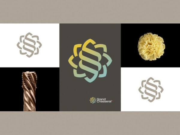
Grand Chasseral, a triumph in Brand Design and a standout in the world of branding projects, was brought to life by the creative minds at Stractis. Led by Sebastien Canepa and supported by Bruce Rennes, this project was commissioned by the Fondation pour le rayonnement du Jura bernois.
Given the creative brief to craft a logo resonating with simplicity while being rooted in nature and embracing cutting-edge technology, Stractis embarked on a journey to establish a visual identity for the Swiss region of Bernese Jura. Remarkably, this region had never had its own distinct visual identity before.
The resulting logo serves as a common denominator in image and communication for the region. It not only captures the essence of nature and the future but also pays homage to the local foods, including the renowned Tête de Moine cheese, and highlights the precision industry expertise that the region is globally acclaimed for. Grand Chasseral’s visual identity, crafted by Stractis, is a shining example of how design can unite diverse elements and showcase the unique qualities of a region through a cohesive and impactful brand identity.
Winner in Brand design / Branding
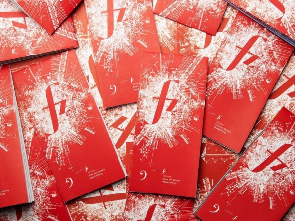
Ernst von Siemens Musikstiftung’s 50th-anniversary celebration, a winner in Brand Design and a standout in the realm of Branding projects was brought to life by the visionary team at Jäger & Jäger. Led by Olaf Jäger and supported by Regina Jäger, Tanja Weich, Reinhard Thomas, and Nico Nolle, this project was commissioned by the esteemed Ernst von Siemens Musikstiftung.
The campaign image for this milestone year is a dynamic fusion of an fz as a musical exclamation mark, symbolizing forzando—a sudden, powerful accent in music. The visual impact is amplified by a fireworks display of stacked, award-winning scores from the past 50 years—an explosive celebration of musical excellence. BÄÄÄM!
Winner in Brand design / Branding
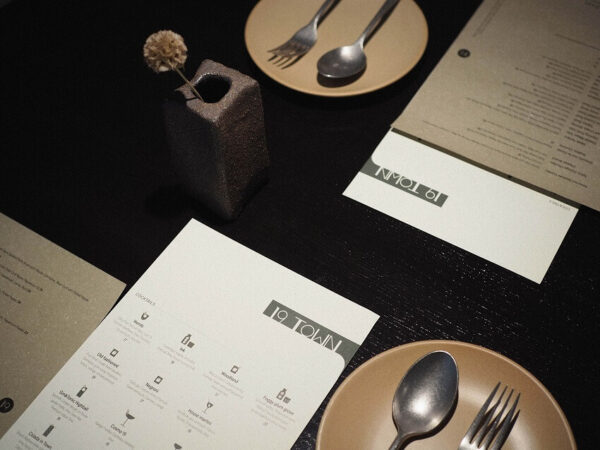
The 19 Town-Brand Design, a triumph in Brand Design and a shining example in the world of branding projects, is a creation by the talented lead designer, Lu Huang. Commissioned by 19 Town, a contemporary Chinese restaurant and lounge bar situated in Los Angeles, California, this project challenges preconceived notions of Chinese cuisine.
The restaurant’s name, “19/nineteen,” cleverly plays on words, as it is a homophone for the Chinese words for “food” and “drink.” Reflecting the inclusivity of Southern California and the hospitality of Chinese culture, 19 Town’s brand values are deeply embedded in its visual identity.
To innovate, embrace, and connect, 19 Town’s aesthetics showcase a minimalist design emphasizing geometric balance. This design choice signifies global influences and a futuristic outlook for Chinese restaurants, breaking away from traditional stereotypes. In the realm of Branding projects, the 19 Town-Brand Design stands as a testament to the power of visual language in challenging perceptions and creating a contemporary and inviting brand experience for a modern Chinese dining experience.
Winner in Brand design / Branding
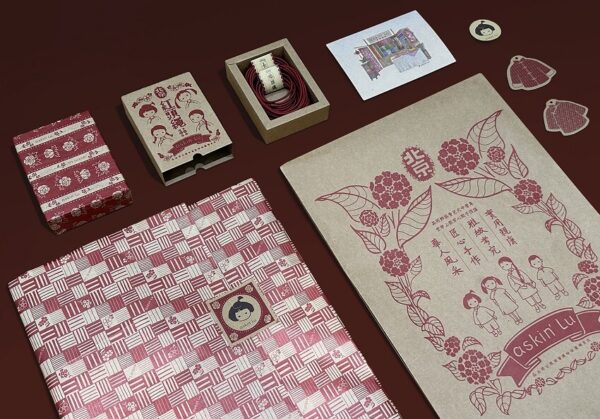
The Askin’ Lu- Brand Design, a standout in Brand Design and a remarkable achievement in the realm of branding projects, was brought to life under the creative leadership of Lu Huang. This project was commissioned by Chan Lu Yoyo Trading Co., Ltd (Beijing) for their children’s clothing brand, Askin’ Lu.
Askin’ Lu, based in Beijing, China, is dedicated to crafting high-quality, skin-friendly traditional clothes for kids. The brand’s unique identity is defined by its signature color, China Red, which embodies the essence of Chinese culture and symbolizes good fortune. The logo features a nostalgic-styled girl, and the brand patterns showcase intricate Chinese flowers.
Taking packaging to the next level, Askin’ Lu employs letterpress techniques to print their packages, adding a touch of elegance. By incorporating traditional elements and techniques, the brand showcases a deep appreciation for delicate Chinese aesthetics.
Winner in Brand design / Branding, Corporate identity / Branding
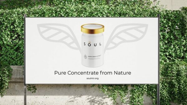
The Soul- Brand Design and Corporate Identity, a double winner in Brand Design and Corporate Identity within the realm of branding projects, is a masterpiece crafted by Aida Pioneer. Led by the talented Dzmitry Apolenis, this project was commissioned by Soul, a producer of natural plant extracts.
Soul’s scope encompassed the brand idea, name, identity, and package design. The concept revolves around the notion that all living things have a soul, and for plants, their soul is embodied in their natural extracts. The central element of the new identity is a slim golden nimbus—a powerful symbol representing utility and purity.
Winner in Brand design / Branding
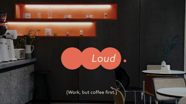
The Loud Cafe Brand Design was a solo endeavor led by the talented Peiyao(Heather) Tang. Commissioned by LOUD CAFE, a local coffee shop, this project aimed to create a welcoming brand identity, overcoming challenges posed by the pandemic.
Despite the limitations of communicating solely over the phone with the customer and interior designer, Peiyao(Heather) Tang successfully crafted a visually appealing brand identity. The circular pattern and the name “LOUD CAFE” draw inspiration from the area’s traditional feel, reflecting the cafe’s roots in the local community.
Winner in Brand design / Branding

The KHASA M Brand Design, a winner in Brand Design was another solo triumph led by the talented Peiyao(Heather) Tang. This branding project was commissioned by KHASA M, a fashion brand inspired by Dante’s Divine Comedy and dedicated to embodying women’s freedom and authenticity.
Taking inspiration from the cheetah, an ancient Egyptian cat deity symbolizing feminine strength, KHASA M’s brand name reflects its commitment to empowering women. Despite challenges posed by time zones and the pandemic, Peiyao(Heather) Tang overcame them with thoughtful design choices, using serif typefaces to eloquently convey the brand’s narrative.
The brand’s chosen color, red, symbolizes maturity and independence, further reinforcing its values.
Winner in Brand design / Branding, Brand identity / Branding
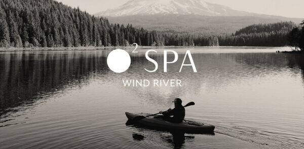
The Wind River 02 Spa is a masterpiece crafted by the talented duo Meaghan Barry and Lilian Crum at Unsold Studio. Commissioned by Audrey Wallace, the owner of Wind River 02 Spa, this branding project beautifully captures the essence of luxury while honoring its blue-collar home in Pinedale, Wyoming.
Wind River 02 Spa stands as a haven in the small town, catering to both locals and tourists, as well as men and women seeking recovery, muscle healing, or simply a place to rest and recharge. Owned and operated by locals, the spa is deeply rooted in the Pinedale community, providing a “breath of fresh air” while seamlessly blending into the natural landscape.
Winner in Brand design / Branding, Logo design / Branding, Brand identity / Branding
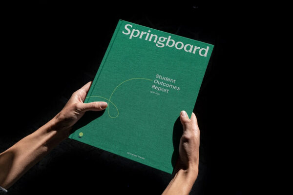
The Springboard is a brilliant creation by Milkshake Studio. Led by the accomplished Alex Martineau and supported by the talented team comprising Simon Goetz, Noora Manchanda, Xochitl Lozano, Brenan Stetzer, and Ruairi Conway, this project was commissioned by Springboard, an online learning platform with a mission to revolutionize online education.
Springboard aims to connect learners to an innovative online learning model, breaking free from the constraints and inequalities of traditional education. In the fiercely competitive market, the platform sought a rebrand that would equip them with the tools to connect with a broader audience.
Winner in Brand design / Branding
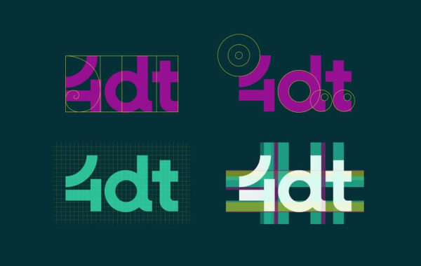
The 4DT, a winner in Brand Design, is a testament to the creative prowess of Pragma. Under the leadership of Jonathan Quesnel, this project was commissioned by 4DT, a consulting company specializing in design thinking services.
4DT’s founder sought to update the visual identity in alignment with the evolution of the company’s offerings. Pragma Creation rose to the challenge, crafting a new identity that mirrors 4DT’s approach—dynamic, innovative in color palette, and seemingly simple yet the result of a strategic and skillful execution.
The visual identity features a unique symbol, a dynamic “4” built from the two capital letters “D” and “T,” representing Design Thinking. This symbol not only encapsulates the essence of the company but also serves as a recognizable and versatile element, especially on social networks.
Winner in Brand design / Branding
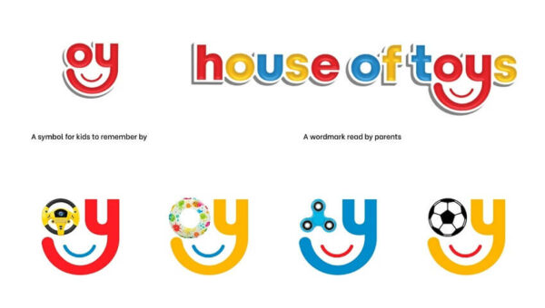
The House of Toys, a winner in Brand Design, is a project crafted by Kreo Design. Under the leadership of Darshita Thaker, this project was commissioned by Tablez, part of the Lulu International Group, for “House of Toys,” India’s first kids’ superstore.
Kreo Design embarked on the mission to create an iconic brand identity for House of Toys, positioning it as a progressive, global, and advanced kids’ brand for active engagement. The design journey began with the creation of a memorable and dynamic identity, featuring an iconic ‘smiley’ mnemonic as part of the logo.
Winner in Brand design / Branding, Brand identity / Branding
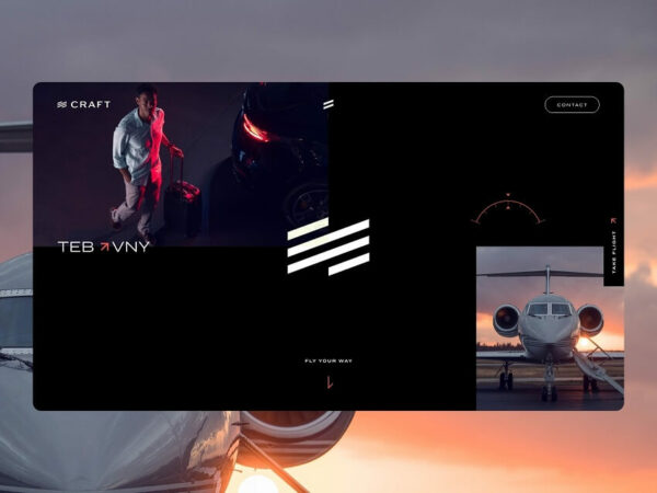
The Craft Digital Brand Experience, a multi-category winner in Brand Design, Brand Identity, Websites, User Experience Design, and User Interface Design within the realm of Branding projects, is a remarkable achievement by Ryze Agency. Under the leadership of David Smith, this branding project was commissioned by Craft, a Miami-based private jet charter company.
Craft aimed to provide a private flight experience that surpasses the highest expectations of the world’s most discerning customers. Recognizing the need for a new brand and online presence to reintroduce their offering and align their brand perception with their values and service, Craft partnered with Ryze Agency.
Winner in Brand identity / Branding
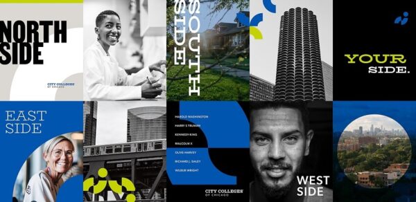
The City Colleges of Chicago Rebrand, a winner in Brand Identity within the realm of branding projects, is a transformative endeavor led by Simple Truth Communication Partners Inc. Under the guidance of Kim Terzis, this project was commissioned by the City Colleges of Chicago.
Recognizing the need for a cohesive and impactful brand identity that connects the entire system while allowing each college to express its unique culture, Simple Truth Communication Partners worked closely with stakeholders at the district and community college levels. The result is an architecture that ties the entire brand system together, giving each college distinct personality traits and cultural drivers.
The brand identity and expression system crafted by Simple Truth Communication Partners is dynamic, on the move, and full of heart. This approach allows each college to maintain its individuality while contributing to a unified system that is seven strong. The impact of this rebranding effort is evident in the enrollment success, with a remarkable +6.9% year-over-year growth, surpassing Illinois community college and national averages.
Winner in Brand identity / Branding
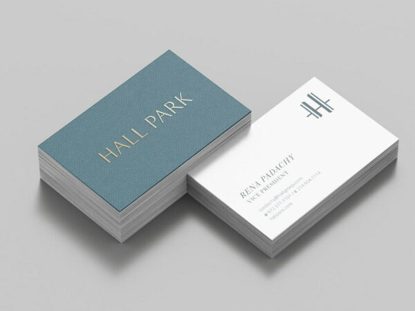
The HALL Park is a testament to thoughtful design led by RSM Design. Under the leadership of Harry Mark, FAIA, this project was commissioned by the HALL Park Group to bring to life a unique retreat amidst the suburban landscape of Frisco, Texas.
HALL Park stands as a distinctive space that harmoniously combines work, living, and community, aiming to become a civic legacy for the future. RSM Design’s design team was entrusted with the task of materializing the vision of HALL Park through comprehensive branding and marketing efforts.
The result is a meticulously crafted brand strategy and brand identity, and a suite of print and digital applications, including website design and a stationery suite.
Winner in Brand identity / Branding
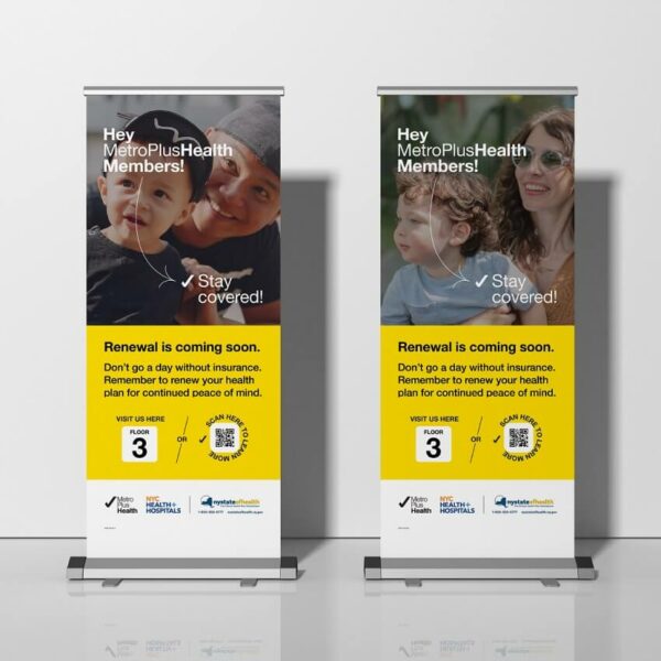
The MetroPlusHealth Brand Identity Campaign, a winner in Brand Identity, is a striking manifestation of thoughtful design led by Bellweather Agency. Under the leadership of Emily Lessard, this branding project was commissioned by MetroPlusHealth.
The new MetroPlusHealth brand identity stands as a testament to a health insurance plan designed for New Yorkers by New Yorkers, prioritizing people over profit. Bellweather Agency’s expertise in crafting a compelling brand identity is evident in the impactful and purpose-driven campaign that communicates the essence of MetroPlusHealth as a healthcare solution rooted in community and care. In the world of Branding projects, the MetroPlusHealth Brand Identity Campaign shines as an example of design that goes beyond aesthetics, creating a meaningful connection with its audience and reflecting the values of the community it serves.
Winner in Brand identity / Branding
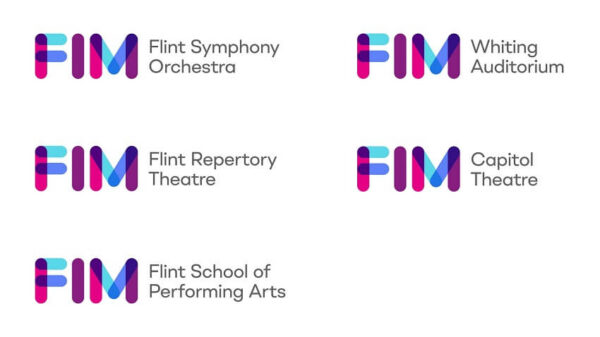
In the landscape of branding projects, the FIM (Flint Institute of Music) stands out as a transformative force in the performing arts, marked by a compelling brand identity campaign led by Minelli, Inc. Under the guidance of Mark Minelli, this project was commissioned by FIM, a dynamic producer and presenter of the performing arts based in Flint, MI.
In 2021, FIM expanded its reach to encompass two of Flint’s prominent venues: Whiting Auditorium and Capitol Theatre. It was at this pivotal juncture that Minelli, Inc. was entrusted with the task of creating a new brand to unify the organization. The result is a vibrant and cohesive brand identity, from the impactful new logo to a dynamic toolkit and brand architecture that enables FIM to enhance awareness and engagement.
Winner in Brand identity / Branding
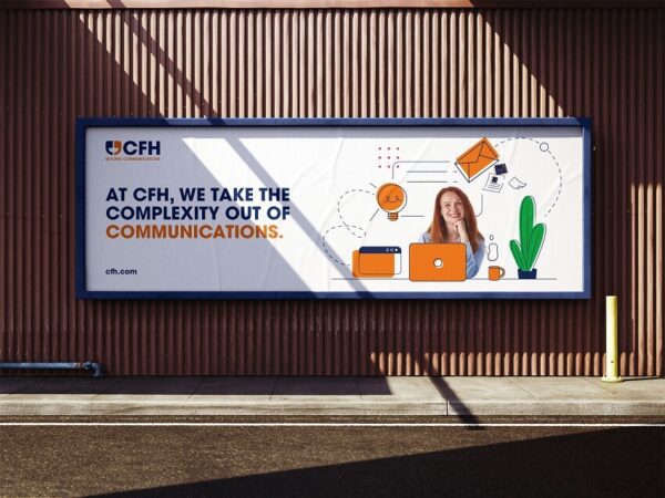
Frost Creative Limited has left an indelible mark with its exceptional work on “Empowering Effective Multichannel Communications for CFH.” Under the guidance of Gary Frost, the lead at Frost Creative, this project was commissioned by CFH Docmail Ltd, a national powerhouse in multichannel communications.
CFH, known for providing innovative solutions for cost-effective and efficient client-customer connections, faced a challenge. With a diverse range of products and services, including Dotpost, Docmail, and Print UK, there was a growing need for clarity regarding the relationships between these brands and the overarching CFH identity.
Frost Creative rose to the occasion, tasked with reviewing and redefining CFH’s brand identity to eliminate confusion and enhance audience understanding. The result is a revitalized brand that encapsulates CFH’s unique story and value proposition. Frost Creative’s expertise, spanning strategy, design, digital, print, and physical environments, was seamlessly woven into a coherent and engaging brand narrative.
Winner in Brand identity / Branding, Websites / Online Media
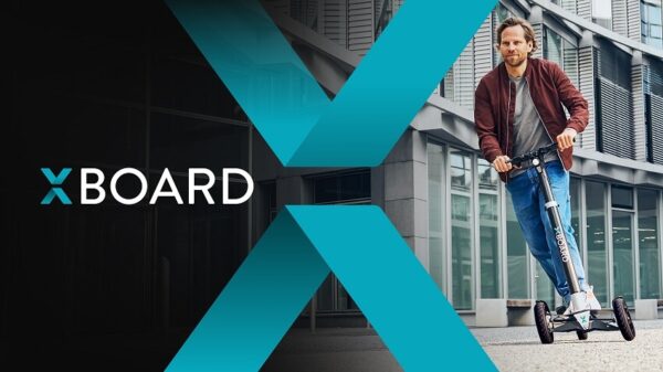
In the expansive landscape of Branding projects, Brandcode GmbH has etched its mark with an exceptional venture – the “Mubea U-Mobility XBoard.” Under the leadership of Martina Lewis, the team at Brandcode crafted a bold new identity for the XBoard product brand, a groundbreaking e-scooter that redefines driving safety, handling, and fun.
The XBoard stands out with its patented folding mechanism, seamlessly transforming into a convenient size with a gentle kick on the step crank lever. This core feature becomes the essence of the brand, and the innovative product design converges with the brand to create a distinctive logo encapsulated in the bold “X.”
Beyond the visual identity, Brandcode executed a comprehensive strategy, including the development of the website, App UI-Design, Social Media posts, and other collaterals. The result is a cohesive and engaging brand narrative that reflects the innovation, excitement, and convenience embedded in the Mubea U-Mobility XBoard.
Winner in Brand identity / Branding
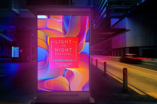
Factory has left an indelible mark with their exceptional work on “Light to Night 2023.” Helmed by lead designer Roy Wang and a talented team including Chrystal Lim, Tamelia Lim, Sandra Lau, and Lin Chi Chen, Factory took on the challenge presented by the National Gallery Singapore to organize the anchor event of the Singapore Art Week.
As the festival designers, Factory drew inspiration from the theme “Here & Now,” reflecting on how artists create works in reaction to their time and place. The resulting design encapsulates the essence of the present moment, inviting visitors to contemplate the true meaning of being in the present.
Using intersecting forms with a bold color scheme that seamlessly transitions from day to night, Factory developed an abstract and colorful key visual for the festival. The dynamic forms create a sense of fluidity, embodying the exciting and immersive experience that Light to Night promises to deliver.
Winner in Brand identity / Branding
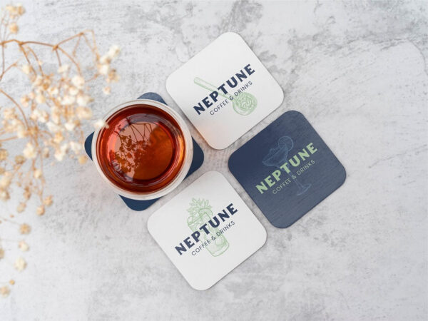
Neptune Coffee & Drinks emerges as a beacon of branding brilliance, with the visionary touch of lead designer Cansu Dagbagli Ferreira. Nestled in Izmir, Turkey, this new cafe draws inspiration from the sea god Neptune, and the branding reflects this maritime concept through a series of thoughtful design choices.
The color palette, reminiscent of the deep blue sea and refreshing mint green, creates a relaxing and inviting atmosphere. Complemented by brighter secondary colors, the design captures the sunny and revitalizing energy that defines the cafe.
Typography plays a key role in shaping the brand’s identity, with clean choices that nod to traditional cafe signage. The title typeface exudes a warm and intimate mood, while the body typeface ensures easy readability, culminating in a harmonious blend that radiates youthful energy and a welcoming ambiance.
Winner in Brand identity / Branding

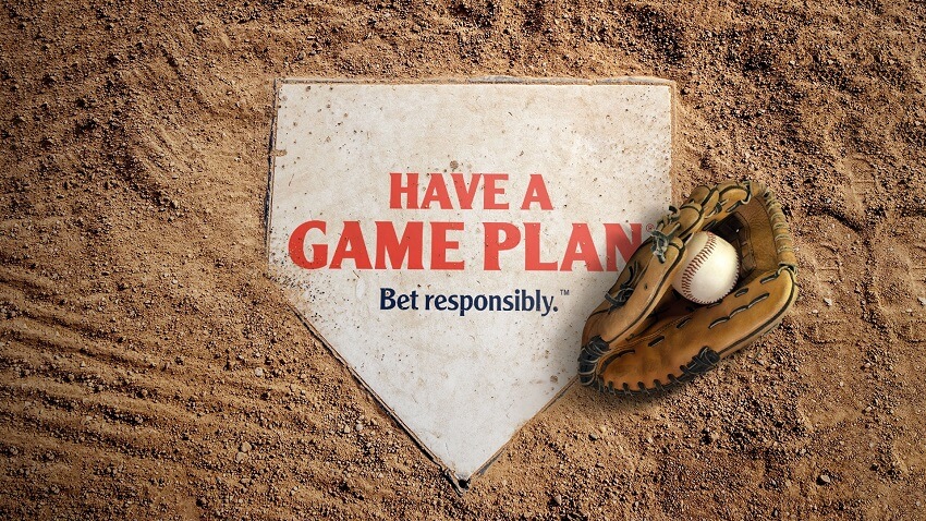
The American Gaming Association (AGA) teamed up with NJI to unveil the Have A Game Plan brand, a champion in promoting responsible, legal sports betting. With Glen Swart and Dale Campbell at the helm, the NJI team orchestrated a slam-dunk success through visually striking design and motion graphics.
In collaboration with major leagues like the NBA, MLB, NHL, and WNBA, NJI crafted a series of engaging digital assets and videos. This not only heightened AGA’s visibility but also legitimized in-venue sports betting. The Have A Game Plan brand became a beacon of responsibility, amplifying AGA’s message and educational resources with a consistent and compelling tone across various social and digital platforms.
Winner in Brand identity / Branding
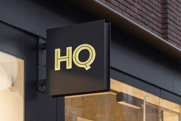
Media–Objectives, led by Joe Lawton, brought vibrancy and community focus to Upland Park’s HQ (Headquarters) project. Nestled in Huntsville, Alabama, this master-planned residential and mixed-use development by Nicol Investment Company embodies lighthearted robustness.
As the central hub in the Research Park area, HQ boasts creative office spaces, lively dining, and retail offerings all seamlessly connected under one roof. The brand and website, crafted by the adept team at Media–Objectives, mirror the spirited essence and community-driven facilities of Upland Park, elevating it to a standout in Huntsville’s landscape.
Winner in Brand identity / Branding
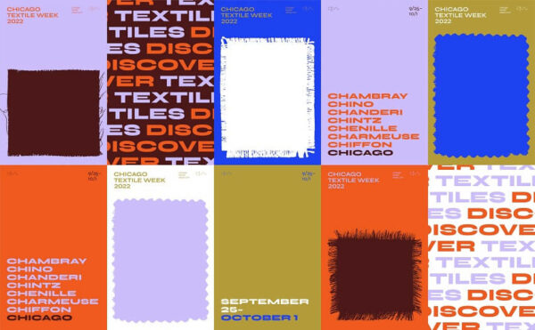
Media–Objectives, under the leadership of Jacob Goble, masterfully crafted the brand identity for Chicago Textile Week. This event seamlessly weaves together the realms of interior design, fiber art, and fashion, creating a tapestry that explores Chicago’s rich textile history and its promising future.
As the event gained rapid popularity, the need for a new brand identity and signage strategy became apparent. Working closely with organizers and sponsors, the design team established a graphic language that boldly and minimally captures the essence of textiles. A fresh color scheme, typeface, and graphic framing system were introduced to represent the tactile qualities of fabric in both print and digital promotional materials, as well as event signage and collateral. The result is a visual feast that encapsulates the tactile world of textiles, setting Chicago Textile Week apart as a vibrant and dynamic experience.
Winner in Brand identity / Branding
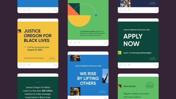
Smith & Connors, led by the talented Talie Smith, played a pivotal role in crafting the brand identity for Justice Oregon for Black Lives—an initiative by Meyer Memorial Trust that emerged in response to the poignant protests against the unjust deaths of George Floyd, Ahmaud Arbery, Breonna Taylor, and others.
The challenge was to develop a brand that exuded optimism, boldness, and a deep connection to Black traditions. The result is a comprehensive identity marked by modern illustrations as the cornerstone of its language, complemented by thoughtful choices in typography, color, and layouts. Smith & Connors went the extra mile, creating a series of social templates and presentation materials for the communications team, ensuring the brand’s voice resonates powerfully and meaningfully. The initiative stands as a testament to the impact that thoughtful design can have in amplifying voices for justice and equality.
Winner in Brand identity / Branding
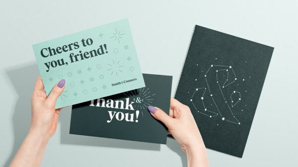
Smith & Connors, under the creative helm of Talie Smith, took on the challenge of rebranding their own agency, and the result is a true testament to their commitment to core values and visual identity.
The goal was clear: align the visual identity with the company’s fundamental values. With a focus on joy, the rebranding effort embraced welcoming typography, a vibrant color palette, expressive iconography, and engaging imagery. Designed to be accessible, the new brand places the audience and their needs at the forefront, creating a warm and inclusive experience. The agency went the extra mile, developing expressive social templates, a digital-friendly visual language, and a suite of digital and print collateral. This self-rebrand showcases not only their design prowess but also their dedication to creating a brand that resonates authentically with their audience.
Winner in Corporate identity / Branding

James Dawson and JD Designs took on the challenge of crafting a comprehensive strategy, branding, and identity design for Atraxo—a digital platform facilitating connections between aviation fuel buyers and sellers.
Atraxo’s brand mark mirrors the sleek structure of an aircraft, employing geometric precision to communicate quality and streamlined digital processes. The central ‘X’ serves as a visual representation of the connection between buyers and sellers within the aviation industry. The spiral brand pattern draws inspiration from jet engine design, symbolizing the intelligent engineering behind Atraxo’s products, aimed at achieving swift customer outcomes through automation. This branding project not only showcases a sophisticated visual identity but also reflects the intricate synergy of design and functionality in the aviation fuel marketplace.
Winner in Corporate identity / Branding
Lee Selsick and Next Brand embarked on a transformative journey with Assembled Media, a media planning and buying business, aiming to rebrand for enhanced engagement with their target client base—specifically, challenger brands.
The rebranding mission called for a dynamic, vibrant, and edgier brand identity that resonates with the essence of Assembled Media’s new direction. To capture this spirit, the team incorporated motion heavily into the brand, ensuring a dynamic visual representation. The focus was on presenting data and content in a clear and coherent style, aligning with the company’s evolution towards a more impactful and engaging brand presence. This project exemplifies the seamless fusion of strategic thinking and design execution in crafting a brand that speaks to the heart of its audience.
Winner in Logo design / Branding, Beverage / Packaging, Brand identity / Branding
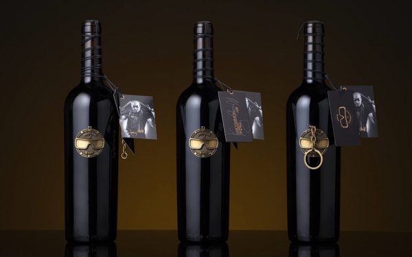
Luis Marques and the M&A Creative Agency orchestrated a symphony of creativity with their project “UNCOMMON WINES,” a collaboration with the renowned drummer Kenny Aronoff. Recognized by Rolling Stone magazine as one of the 100 greatest drummers of all time, Aronoff ventured into the world of wine, and M&A Creative Agency played a crucial role in shaping the brand’s identity.
The agency took charge of naming, branding, packaging, and meticulous execution, resulting in a luxurious and distinctive presentation. The brand unfolds with a lavish antique gold-plated locket, embodying Aronoff’s personality. The design prominently features his signature sunglasses, drumsticks—a constant extension of his craft—and a circular shape reminiscent of his drum set. This project stands as a testament to the harmonious fusion of musical and visual artistry, creating a brand that is as exceptional as the wines it represents.
Winner in Retail Branding / Retail
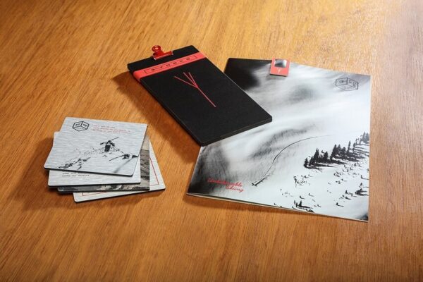
Ellen Bruss and her team at Ellen Bruss Design carved out an exceptional identity for “3 Forks Bar and Restaurant,” nestled in the picturesque landscape of Moonlight Basin, Big Sky, Montana. The restaurant, named after the challenging Three Forks ski run it overlooks, sought a brand that captured the essence of adventure and celebrated the breathtaking scenery.
The design palette, adorned with black, cream, and red, intertwined vintage ski imagery with contemporary visuals of the thrilling ski run. The brand resonates with the early history of skiing, creating a spirited atmosphere. From bar dice to coasters, menus to custom paper clips, postcards to cocktail glasses, the team crafted a cohesive and immersive brand experience that echoes the heart-pumping excitement of the Three Forks ski run.
Winner in Other / Branding
Factory, under the creative helm of Roy Wang, took the spotlight in the 8th Singapore International Photography Festival (SIPF) with their stellar design work. The biennial event, a convergence of global minds passionate about advancing the art and appreciation of photography, appointed Factory as the official festival designer.
Factory’s role encompassed crafting the festival’s brand identity, marketing collaterals, and spatial design for exhibitions across various Singapore venues. The resulting design was a harmonious blend of creativity, aesthetics, and functionality, creating an immersive experience that celebrated the diverse and profound world of photography.
Winner in Promotional items / Branding
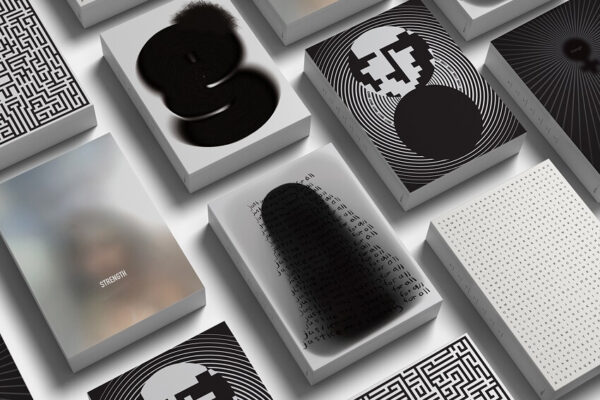
Antonia Skaraki and her team at A.S. Strategy Branding & Communication made a powerful impact with their Women Empowerment branding project, winning accolades in Promotional Items and Social Responsibility categories. This corporate gift goes beyond the ordinary, delivering a poignant message about the pervasive abuse suffered by women globally.
Using Cretan Tsikoudia, the team crafted symbolic bottles representing different women, each adorned with distinct clay faces embodying powerful ideals such as Freedom, Change, Equality, Justice, Education, Choice, and Strength. The bottles, accompanied by artistic graphic representations and a wall poster, stand as a collective tribute to women’s solidarity worldwide. A.S. Strategy’s creative approach beautifully merges art, social responsibility, and branding to deliver a message that resonates deeply.
Winner in Promotional items / Branding
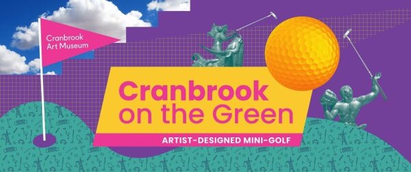
Meaghan Barry and Lilian Crum from Unsold Studio showcased their creative prowess in the project “Cranbrook on the Green: Artist-Designed Mini-Golf,” earning recognition in the Promotional Items/Branding category. Their identity and ad campaign pay homage to Cranbrook’s legacy, incorporating iconic sculptures and campus iconography in Bloomfield Hills, Michigan.
The design exudes a nostalgic summertime vibe with vibrant colors reminiscent of the 80s/90s, coupled with Esprit-like geometry and patterns. The collage approach, inspired by the renowned designer April Greiman, adds a unique and visually engaging dimension to the campaign. Unsold Studio’s work not only promotes the mini-golf experience but also captures the essence and artistic heritage of Cranbrook.
As we continue our exploration of these award-winning branding projects, a broader theme emerges: the success of strategic brand development. Each project serves as a case study in transforming spaces, narratives, and communities. The evolution of brand identity is not just a visual spectacle but a strategic effort that shapes perceptions and fosters a sense of connection.
Beyond the accolades, each project carries a story, providing a wealth of branding inspiration. These showcased branding projects not only reflect current trends but also hint at the future of brand identity. The trends woven into each project, highlight the dynamic nature of branding in our ever-changing world.
As we conclude our journey through the 45 award-winning branding projects, the main message is clear—creativity knows no bounds. These projects are more than visual delights; they are sparks of inspiration for every creative designer. From innovative strategies to successful development and the evolution of brand identity, the C2A winners showcase the multifaceted nature of branding. Let these branding projects be the driving force that elevates your work to new levels, securing your place in the vibrant world of branding excellence.