

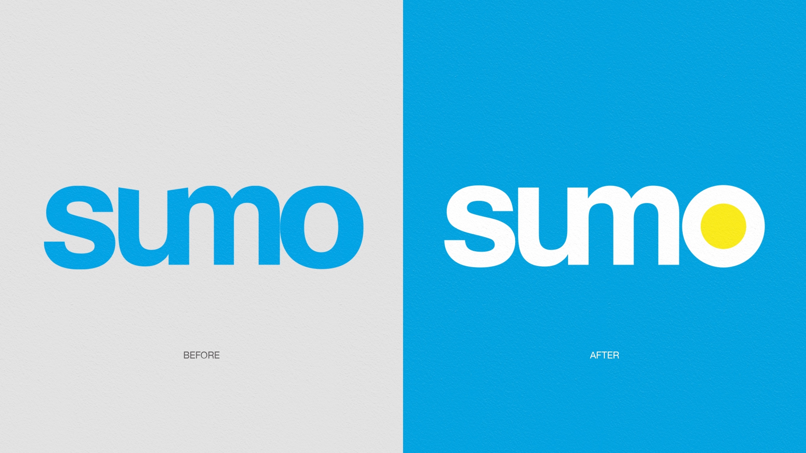
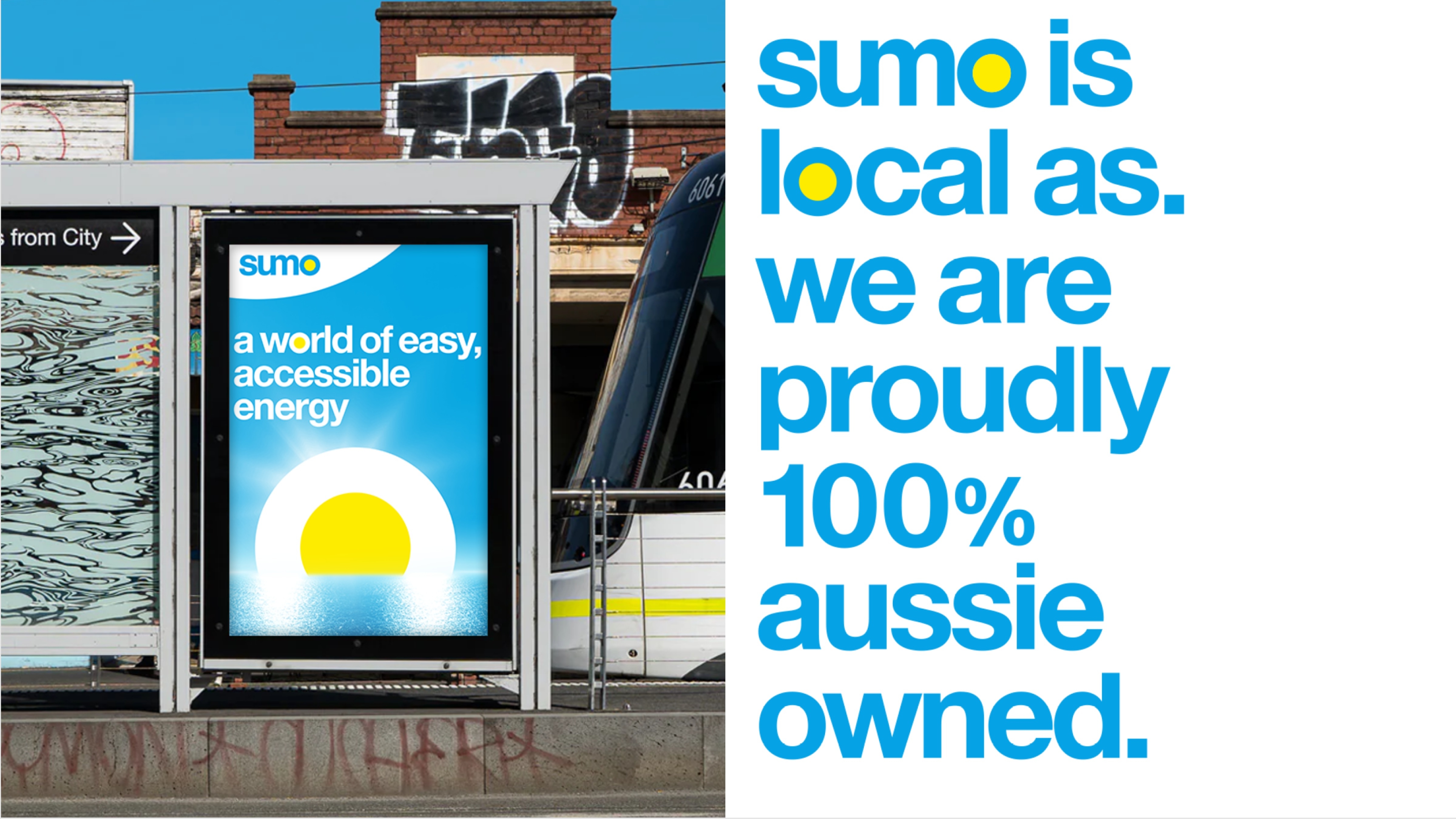

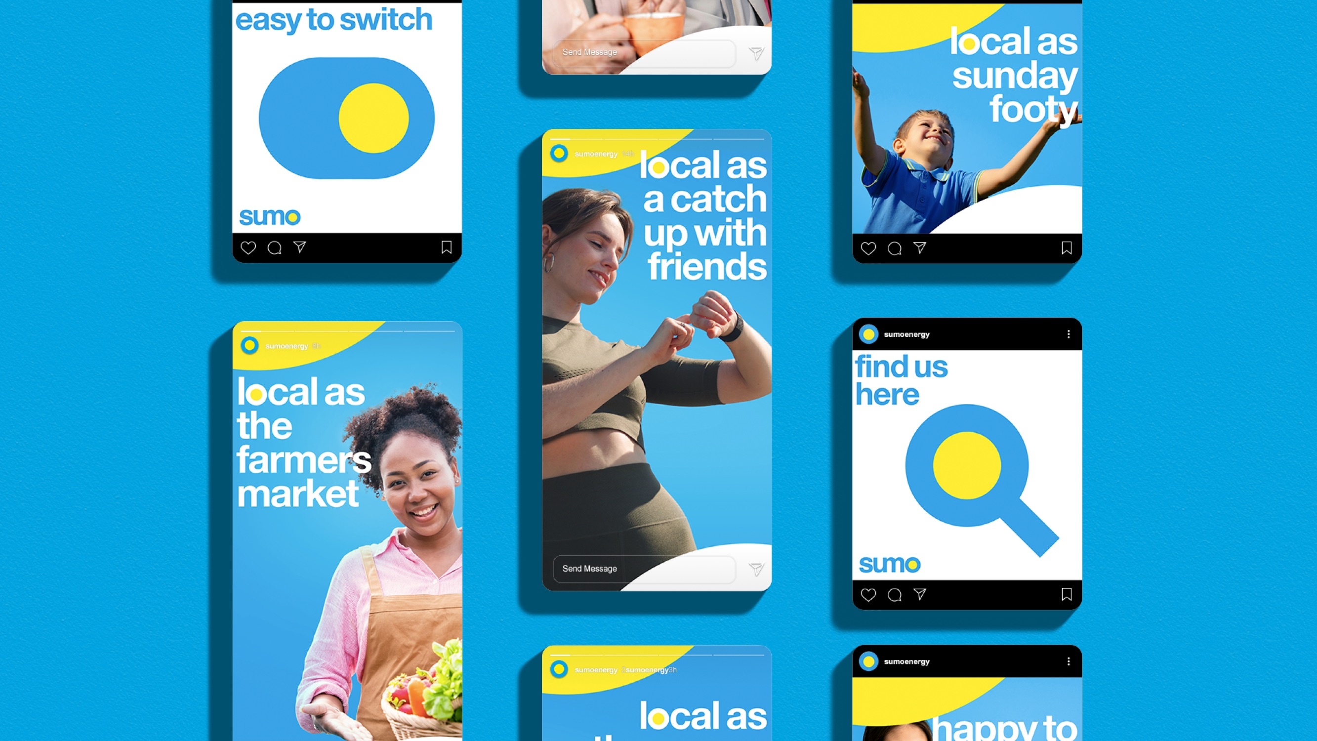
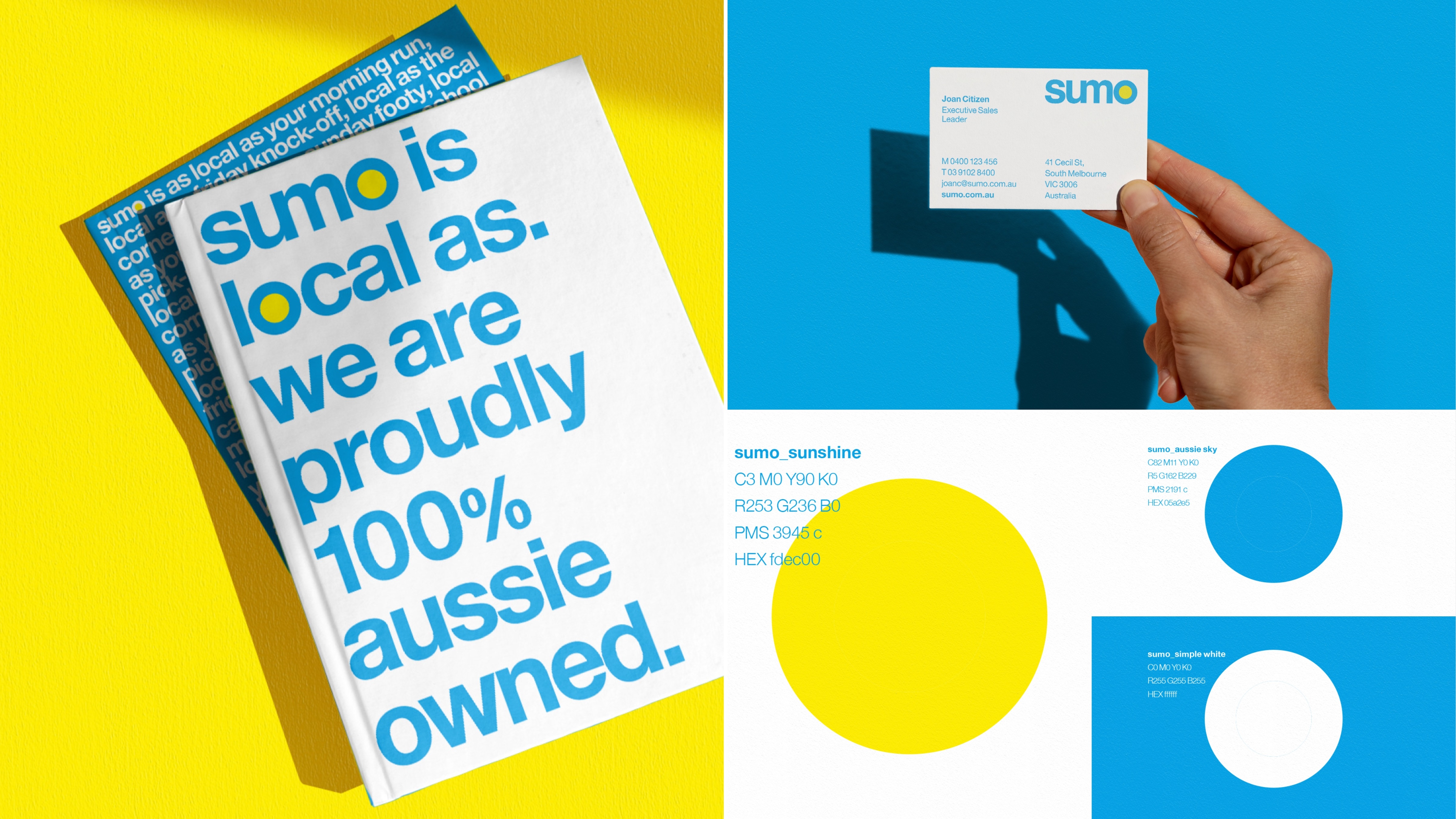
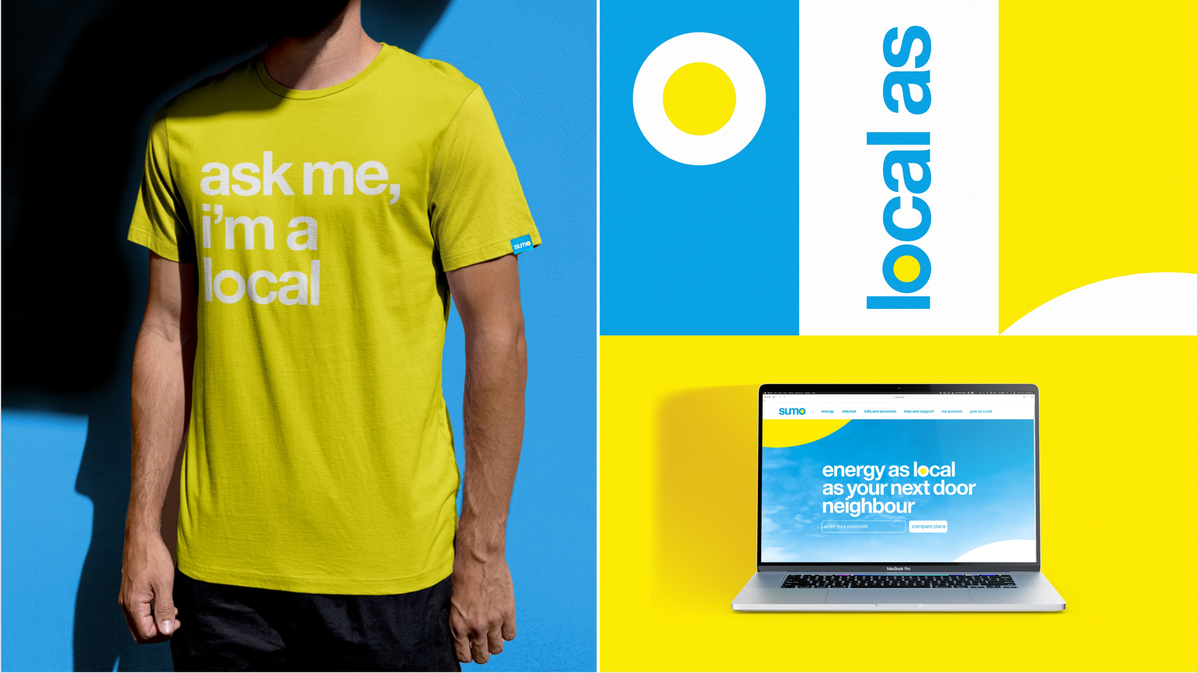

Sumo Energy had lost its challenger edge, blending into a commodity market. The Edison Agency repositioned it with a “Local As” strategy, championing Australian ownership and service. A refreshed identity with an optimised brandmark featuring sun symbolism, vibrant local design cues, and approachable voice rebuilt trust and distinctiveness. Research showed 60% found the direction appealing, and over half would consider switching, proving the new identity delivered relevance, cut through, and measurable commercial impact.
An independent design agency. Gutsy ideas. Behaviour-led strategy. Branding educators.