Winner 2023 / Packaging / Beverage 
Angostura Bitters, Redesign
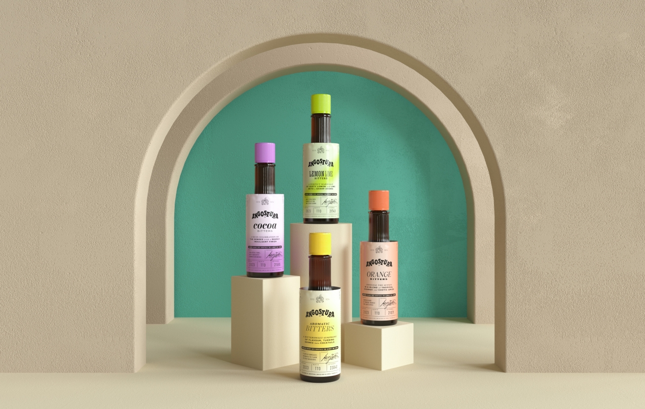
- PrizeWinner in Beverage / Packaging
- UniversityConcordia University, St. Paul
- LeadMatthew Thomson
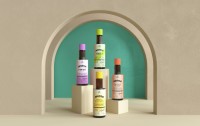
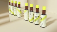
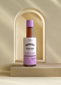
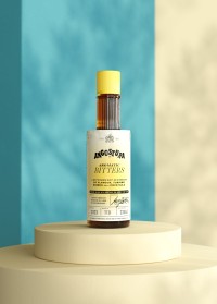
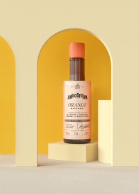
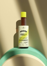
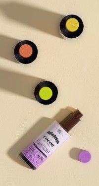
Angostura® Bitters originally made a mistake when creating their product 200 years ago, leading to their iconic oversized label. The new bottle invites all consumers into the conversation with a structured and attractive introduction to what this product is. Due to their distinct flavor profiles, I gave each bottle its own typographic style while maintaining an overall system to the product line. If you reference the three lines of copy below the bitter's flavor on the bottles you'll get an introduction to how each bottle behaves. This correlates to how I introduced color onto each label.

