Before we plunge into the exclusive interview with Anna Jordan, let’s explore some intriguing facts about this award-winning designer:
– Anna hails from the creative hub of Rochester, New York, where her studio becomes the playground for her artistic endeavors.
– Her passion lies in the intersection of typography and materials, evident in her mesmerizing and award-winning book cover designs.
– The recent triumph at the C2A Awards has not only added another feather to her cap but has also thrust her into the limelight of the design world.
Award Category: Other books / Books
Lead: Anna Jordan
Client: Open Letter Books
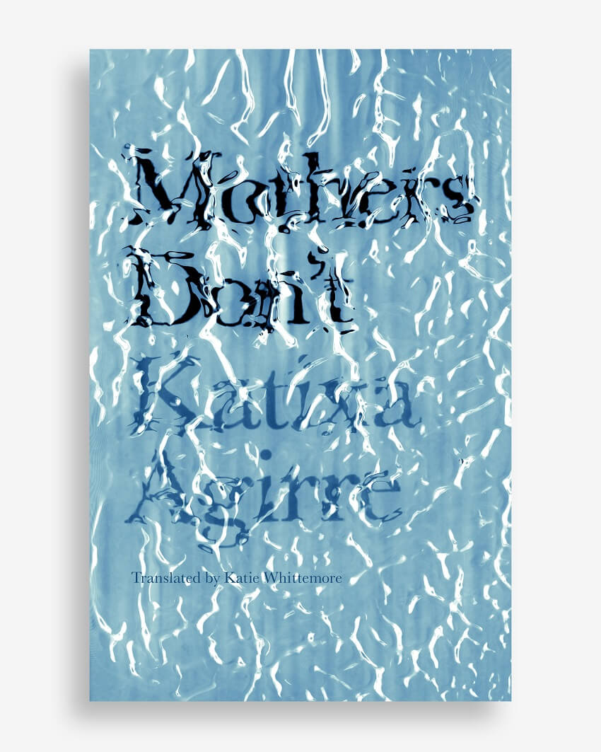
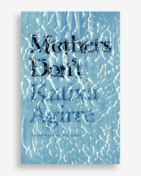
Behold the cover of a chilling novel where a mother, driven by an inexplicable force, drowns her twins in the bathtub. Anna Jordan, the mastermind behind this captivating artwork, employed a unique technique—no Photoshop tricks here. The image is a photograph of a physical construction made with glass and gel, creating the illusion of an underwater type.
Anna’s creative genius unfolds in the delicate dance between typography and materials. The cover is not just a visual treat but a symbolic representation of the novel’s intricate layers, weaving together themes of motherhood, mystery, and the quest for truth.
Anna Jordan: Recognition from peer-reviewed competitions such as C2A helps get my work out there and seen by other designers. The visibility that comes from a competition such as this leads to new clients and connections.
Anna Jordan: C2A is a well-organized competition with an easy, seamless submission process. I didn’t encounter any challenges in submitting my work.
Anna Jordan: Everything is an inspiration. The world is full of art supplies waiting to become images, waiting to become types. I use physical materials in combination with digital tools to create type and image constructions that are both real and illusionary.
Anna Jordan: It can be anxiety-producing to constantly be inventing something new to fill a blank page. I tackle this by following a systematic approach for each project – I have a three-step process of ideating that ensures I always have an abundance of directions to pursue. Another challenge is editing. The last 5% of a project involves making lots of little decisions so the finishing touches are just right.
Anna Jordan: This peer-reviewed award is a tool to leverage in building new connections, gaining new clients, and getting my work out there in the world to be seen.
Anna Jordan: Building a network is important and a long-term investment. I consider award competitions to be an important part of building that network.
Anna Jordan: Many clients look to award annuals for exposure to new designers they may want to work with. I have had new clients contact me after seeing my work in such annuals.
Anna Jordan: The most valuable part of award annuals is being introduced to people you might not otherwise be. Both seeing the other winners’ work and by those winners seeing your work. It is a great networking tool in both directions.
Anna Jordan: Yes I will apply every year as long as the price remains reasonable. The winners annual was a high-quality publication that motivated me to participate again.
Anna Jordan: I don’t worry too much about trends. I just try to make the best work that I can.
Anna Jordan: I hope to continue doing work that is exciting and interesting to me, contributing to the field of book cover design, and exploring the possibilities of type and image.
Anna Jordan: Book cover. A disturbing novel in which a mother kills her twins by drowning them in the bathtub. Another mother, an acquaintance of the murderer, becomes obsessed with investigating the crime and uses her maternity leave to research the hidden truth behind the murder.
The novel is full of contradictions and discoveries and is complete with elements of a traditional thriller. The cover image is a photograph of a physical construction – not a Photoshop effect – to create the illusion of underwater type.
The watery type carries layers of meaning: it references the murders by drowning in the bathtub, the quest for finding truth in a murky mystery (the narrator’s obsessive search), and motherhood (water breaking in pregnancy, water in womb, etc).
Surprisingly, it wasn’t water that I used in the physical construction to create this real effect – it was another material entirely. I love that secret – the design version of a food photographer who uses mashed potatoes to look like ice cream. Wink, wink!
As we wrap up this insightful interview with Anna Jordan, the brilliance of her designs and the depth of her creative process come to the forefront. Anna’s journey, marked by prestigious wins and innovative projects like “Mother’s Dont,” showcases a designer who fearlessly explores the intersection of art and storytelling.
If you’re a fellow creative or design enthusiast, keep an eye on Anna Jordan’s evolving journey, as each project promises to be a masterpiece that transcends the ordinary. In the ever-changing landscape of design, Anna Jordan stands as a beacon of inspiration, continually pushing the boundaries of what’s possible in the world of book cover design and beyond.
—-